|
ß
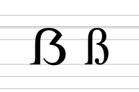
Variant forms of Eszett (from top-left to bottom-right): Cambria (2004), Lucida Sans (1985), Theuerdank blackletter (1933, based on a 1517 type), handwritten Kurrent (1865) In German orthography, the letter ß, called Eszett (IPA: [ɛsˈtsɛt], S-Z) or scharfes S (IPA: [ˌʃaʁfəs ˈʔɛs], "sharp S"), represents the /s/ phoneme in Standard German when following long vowels and diphthongs. The letter-name Eszett combines the names of the letters of ⟨s⟩ (Es) and ⟨z⟩ (Zett) in German. The character's Unicode names in English are double s,[1] sharp s[2] and eszett.[2] The Eszett letter is currently used only in German, and can be typographically replaced with the double-s digraph ⟨ss⟩, if the ß-character is unavailable. In the 20th century, the ß-character was replaced with ss in the spelling of Swiss Standard German (Switzerland and Liechtenstein), while remaining Standard German spelling in other varieties of the German language.[3] The letter originates as the ⟨sz⟩ digraph as used in late medieval and early modern German orthography, represented as a ligature of ⟨ſ⟩ (long s) and ⟨ʒ⟩ (tailed z) in blackletter typefaces, yielding ⟨ſʒ⟩.[a] This developed from an earlier usage of ⟨z⟩ in Old and Middle High German to represent a separate sibilant sound from ⟨s⟩; when the difference between the two sounds was lost in the 13th century, the two symbols came to be combined as ⟨sz⟩ in some situations. Traditionally, ⟨ß⟩ did not have a capital form, although some type designers introduced de facto capitalized variants. In 2017, the Council for German Orthography officially adopted a capital, ⟨ẞ⟩, as an acceptable variant in German orthography, ending a long orthographic debate.[4] Since 2024 the capital ⟨ẞ⟩ (ligature) has been preferred over ⟨SS⟩ (two letters).[5] Lowercase ⟨ß⟩ was encoded by ECMA-94 (1985) at position 223 (hexadecimal DF), inherited by Latin-1 and Unicode (U+00DF ß LATIN SMALL LETTER SHARP S).[6]
The HTML entity UsageCurrent usageIn standard German, three letters or combinations of letters commonly represent [s] (the voiceless alveolar fricative) depending on its position in a word: ⟨s⟩, ⟨ss⟩, and ⟨ß⟩. According to current German orthography, ⟨ß⟩ represents the sound [s]:
In verbs with roots where the vowel changes length, this means that some forms may be written with ⟨ß⟩, others with ⟨ss⟩: wissen, er weiß, er wusste.[7] The use of ⟨ß⟩ distinguishes minimal pairs such as reißen (IPA: [ˈʁaɪsn̩], to rip) and reisen (IPA: [ˈʁaɪzn̩], to travel) on the one hand ([s] vs. [z]), and Buße (IPA: [ˈbuːsə], penance) and Busse (IPA: [ˈbʊsə], buses) on the other (long vowel before ⟨ß⟩, short vowel before ⟨ss⟩).[9]: 123 Some proper names may use ⟨ß⟩ after a short vowel, following the old orthography; this is also true of some words derived from proper names (e.g., Litfaßsäule; advertising column, named after Ernst Litfaß).[10]: 180 If no ⟨ß⟩ is available in a font, then the official orthography calls for ⟨ß⟩ to be replaced with ⟨ss⟩.[11] Additionally, as of 2024, when capitalized, in addition to using capital ⟨ẞ⟩ (STRAẞE), the spelling ⟨SS⟩ (STRASSE) is also possible.[5][12] The previous rule, codified in the Orthography Reform of 1996, had been always to replace ⟨ß⟩ with ⟨SS⟩ in allcaps.[13] In pre-1996 orthography According to the orthography in use in German prior to the German orthography reform of 1996, ⟨ß⟩ was written to represent [s]:
In the old orthography, word stems spelled ⟨ss⟩ internally could thus be written ⟨ß⟩ in certain instances, without this reflecting a change in vowel length: küßt (from küssen), faßt (from fassen), verläßlich and Verlaß (from verlassen), kraß (comparative: krasser).[9]: 121–23 [14] In rare occasions, the difference between ⟨ß⟩ and ⟨ss⟩ could help differentiate words: Paßende (expiration of a pass) and passende (appropriate).[10]: 178  As in the new orthography, it was possible to write ⟨ss⟩ for ⟨ß⟩ if the character was not available. When using all capital letters, the pre-1996 rules called for rendering ⟨ß⟩ as ⟨SS⟩ except when there was ambiguity, in which case it should be rendered as ⟨SZ⟩. The common example for such a case is IN MASZEN (in Maßen "in moderate amounts") vs. IN MASSEN (in Massen "in massive amounts"); in this example the spelling difference between ⟨ß⟩ vs. ⟨ss⟩ produces completely different meanings.[citation needed] Switzerland and LiechtensteinIn Swiss Standard German, ⟨ss⟩ usually replaces every ⟨ß⟩.[15][16] This is officially sanctioned by the reformed German orthography rules, which state in §25 E2: "In der Schweiz kann man immer „ss“ schreiben" ("In Switzerland, one may always write 'ss'"). Liechtenstein follows the same practice. There are very few instances where the difference between spelling ⟨ß⟩ and ⟨ss⟩ affects the meaning of a word, and these can usually be told apart by context.[17]: 230 [18] Other uses Occasionally, ⟨ß⟩ has been used in unusual ways:
HistoryOrigin and development As a result of the High German consonant shift, Old High German developed a sound generally spelled ⟨zz⟩ or ⟨z⟩ that was probably pronounced [s] and was contrasted with a sound, probably pronounced [s̠] (voiceless alveolar retracted sibilant) or [z̠] (voiced alveolar retracted sibilant), depending on the place in the word, and spelled ⟨s⟩.[27] Given that ⟨z⟩ could also represent the affricate [ts], some attempts were made to differentiate the sounds by spelling [s] as ⟨zss⟩ or ⟨zs⟩: wazssar (German: Wasser), fuozssi (German: Füße), heizsit (German: heißt).[28] In Middle High German, ⟨zz⟩ simplified to ⟨z⟩ at the end of a word or after a long vowel, but was retained word internally after a short vowel: wazzer (German: Wasser) vs. lâzen (German: lassen) and fuoz (German: Fuß).[29]  In the thirteenth century, the phonetic difference between ⟨z⟩ and ⟨s⟩ was lost at the beginning and end of words in all dialects except for Gottscheerish.[27] Word-internally, Old and Middle High German ⟨s⟩ came to be pronounced [z] (the voiced alveolar sibilant), while Old and Middle High German ⟨z⟩ continued to be pronounced [s]. This produces the contrast between modern standard German reisen and reißen. The former is pronounced IPA: [ˈʁaɪzn̩] and comes from Middle High German: reisen, while the latter is pronounced IPA: [ˈʁaɪsn̩] and comes from Middle High German: reizen.[30] In the late medieval and early modern periods, [s] was frequently spelled ⟨sz⟩ or ⟨ss⟩. The earliest appearance of ligature resembling the modern ⟨ß⟩ is in a fragment of a manuscript of the poem Wolfdietrich from around 1300.[17]: 214 [30] In the Gothic book hands and bastarda scripts of the late medieval period, ⟨sz⟩ is written with long s and the Blackletter "tailed z", as ⟨ſʒ⟩. A recognizable ligature representing the ⟨sz⟩ digraph develops in handwriting in the early 14th century.[31]: 67–76  By the late 1400s, the choice of spelling between ⟨sz⟩ and ⟨ss⟩ was usually based on the sound's position in the word rather than etymology: ⟨sz⟩ (⟨ſz⟩) tended to be used in word final position: uſz (Middle High German: ûz, German: aus), -nüſz (Middle High German: -nüss(e), German: -nis); ⟨ss⟩ (⟨ſſ⟩) tended to be used when the sound occurred between vowels: groſſes (Middle High German: grôzes, German: großes).[32]: 171 While Martin Luther's early 16th-century printings also contain spellings such as heyße (German: heiße), early modern printers mostly changed these to ⟨ſſ⟩: heiſſe. Around the same time, printers began to systematically distinguish between das (the, that [pronoun]) and daß (that [conjunction]).[32]: 215 In modern German, the Old and Middle High German ⟨z⟩ is now represented by either ⟨ss⟩, ⟨ß⟩, or, if there are no related forms in which [s] occurs intervocalically, with ⟨s⟩: messen (Middle High German: mezzen), Straße (Middle High German: strâze), and was (Middle High German: waz).[29] Standardization of useThe pre-1996 German use of ⟨ß⟩ was codified by the eighteenth-century grammarians Johann Christoph Gottsched (1748) and Johann Christoph Adelung (1793) and made official for all German-speaking countries by the German Orthographic Conference of 1901. In this orthography, the use of ⟨ß⟩ was modeled after the use of long and "round"-s in Fraktur. ⟨ß⟩ appeared both word internally after long vowels and also in those positions where Fraktur required the second s to be a "round" or "final" s, namely the ends of syllables or the ends of words.[17]: 217–18 In his Deutsches Wörterbuch (1854) Jacob Grimm called for ⟨ß⟩ or ⟨sz⟩ to be written for all instances of Middle and Old High German etymological ⟨z⟩ (e.g., eß instead of es from Middle High German: ez); however, his etymological proposal could not overcome established usage.[32]: 269 In Austria-Hungary prior to the German Orthographic Conference of 1902, an alternative rule formulated by Johann Christian August Heyse in 1829 had been officially taught in the schools since 1879, although this spelling was not widely used. Heyse's rule matches current usage after the German orthography reform of 1996 in that ⟨ß⟩ was only used after long vowels.[17]: 219 Use in Roman type  In early modern Latin type (antiqua), a ligature similar to modern ⟨ß⟩ developed out of a long s followed by a round s (⟨ſs⟩), and as such was used in languages such as Italian in alternation with ⟨ſſ⟩, usually based on requirements of space on the page.[33]: 76 However, despite its resemblance to the modern ⟨ß⟩, this ligature was not commonly used as an equivalent to the Fraktur ⟨sz⟩ in German.[34][35] This ligature generally fell out of use in the eighteenth century, together with the use of long s in antiqua.[31]: 73 German works printed in Roman type in the late 18th and early 19th centuries such as Johann Gottlieb Fichte's Wissenschaftslehre did not provide any equivalent to the ⟨ß⟩.[31]: 74 Jacob Grimm began using ⟨ß⟩ in his Deutsche Grammatik (1819); however, it varied with ⟨ſſ⟩ word internally.[31]: 74 Grimm eventually rejected the use of the character; in their Deutsches Wörterbuch (1838), the Brothers Grimm favored writing it as ⟨sz⟩.[35]: 2 The First Orthographic Conference in Berlin (1876) recommended that ß be represented as ⟨ſs⟩ – however, both suggestions were ultimately rejected.[32]: 269 [17]: 222 In 1879, a proposal for various letter forms was published in the Journal für Buchdruckerkunst. A committee of the Typographic Society of Leipzig chose the "Sulzbacher form". In 1903, it was proclaimed as the new standard for the Eszett in Roman type.[35]: 3–5 Until the abolition of Fraktur in 1941, it was common for family names to be written with ⟨ß⟩ in Fraktur and ⟨ss⟩ in Roman type. The formal abolition resulted in inconsistencies in how names are written in modern German (such as between Heuss and Heuß).[10]: 176 Abolition and attempted abolitionsThe Swiss and Liechtensteiners ceased to use ⟨ß⟩ in the twentieth century. This has been explained variously by the early adoption of Roman type in Switzerland, the use of typewriters in Switzerland that did not include ⟨ß⟩ in favor of French and Italian characters, and peculiarities of Swiss German that cause words spelled with ⟨ß⟩ or ⟨ss⟩ to be pronounced with gemination.[17]: 221–22 The Education Council of Zürich had decided to stop teaching the letter in 1935, whereas the Neue Zürcher Zeitung continued to write ⟨ß⟩ until 1971.[36] Swiss newspapers continued to print in Fraktur until the end of the 1940s, and the abandonment of ß by most newspapers corresponded to them switching to Roman typesetting.[37] When the Nazi German government abolished the use of blackletter typesetting in 1941, it was originally planned to also abolish the use of ⟨ß⟩. However, Hitler intervened to retain ⟨ß⟩, while deciding against the creation of a capital form.[38] In 1954, a group of reformers in West Germany similarly proposed, among other changes to German spelling, the abolition of ⟨ß⟩; their proposals were publicly opposed by German-language writers Thomas Mann, Hermann Hesse, and Friedrich Dürrenmatt and were never implemented.[39] Although the German Orthography Reform of 1996 reduced the use of ⟨ß⟩ in standard German, Adrienne Walder writes that an abolition outside of Switzerland appears unlikely.[17]: 235 Development of a capital form  Because ⟨ß⟩ had been treated as a ligature, rather than as a full letter of the German alphabet, it had no capital form in early modern typesetting. Moreover, allcaps was not normally used in Fraktur printing.[4] There were, however, proposals to introduce capital forms of ⟨ß⟩ for use in allcaps writing (where ⟨ß⟩ would otherwise usually be represented as either ⟨SS⟩ or ⟨SZ⟩). A capital was first seriously proposed in 1879, but did not enter official or widespread use.[40] The Orthographic Conference of 1903 called for the use of ⟨SZ⟩ in allcaps until a capital letter could be proposed.[4] Historical typefaces offering a capitalized eszett mostly date to the time between 1905 and 1930. The first known typefaces to include capital eszett were produced by the Schelter & Giesecke foundry in Leipzig, in 1905/06. Schelter & Giesecke at the time widely advocated the use of this type, but its use nevertheless remained very limited. The preface to the 1925 edition of the Duden dictionary expressed the desirability of a separate glyph for capital ⟨ß⟩:
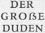
The Duden was edited separately in East and West Germany during the 1950s to 1980s. The East German Duden of 1957 (15th ed.) introduced a capital ⟨ß⟩ in its typesetting without revising the rule for capitalization. The 16th edition of 1969 still announced that an uppercase ⟨ß⟩ was in development and would be introduced in the future. The 1984 edition again removed this announcement and simply stated that there is no capital version of ⟨ß⟩.[42] In the 2000s, there were renewed efforts on the part of certain typographers to introduce a capital, ⟨ẞ⟩. A proposal to include a corresponding character in the Unicode set submitted in 2004[43] was rejected.[44][45] A second proposal submitted in 2007 was successful, and the character was included in Unicode version 5.1.0 in April 2008 (U+1E9E ẞ LATIN CAPITAL LETTER SHARP S).[46] The international standard associated with Unicode (UCS), ISO/IEC 10646, was updated to reflect the addition on 24 June 2008. The capital letter was finally adopted as an option in standard German orthography in 2017.[12] As of 2024, ⟨ẞ⟩ is now the preferred option for depicting the character in capital letters, with ⟨SS⟩ as a second option.[5] RepresentationGraphical variants
The recommendation of the Sulzbacher form (1903) was not followed universally in 20th-century printing. There were four distinct variants of ⟨ß⟩ in use in Antiqua fonts: 
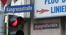
The first variant (no ligature) has become practically obsolete. Most modern typefaces follow either 2 or 4, with 3 retained in occasional usage, notably in street signs in Bonn and Berlin. The design of modern ⟨ß⟩ tends to follow either the Sulzbacher form, in which ⟨ʒ⟩ (tailed z) is clearly visible, or else be made up of a clear ligature of ⟨ſ⟩ and ⟨s⟩.[35]: 2  Use of typographic variants in street signs:
 The inclusion of a capital ⟨ẞ⟩ in Unicode in 2008 revived the century-old debate among font designers as to how such a character should be represented. The main difference in the shapes of ⟨ẞ⟩ in contemporary fonts is the depiction with a diagonal straight line vs. a curved line in its upper right part, reminiscent of the ligature of tailed z or of round s, respectively. The code chart published by the Unicode Consortium favours the former possibility,[47] which has been adopted by Unicode capable fonts including Arial, Calibri, Cambria, Courier New, Dejavu Serif, Liberation Sans, Liberation Mono, Linux Libertine and Times New Roman; the second possibility is more rare, adopted by Dejavu Sans. Some fonts adopt a third possibility in representing ⟨ẞ⟩ following the Sulzbacher form of ⟨ß⟩, reminiscent of the Greek ⟨β⟩ (beta); such a shape has been adopted by FreeSans and FreeSerif, Liberation Serif and Verdana.[48] Typing the character
 In Germany and Austria, a 'ß' key is present on computer and typewriter keyboards, normally to the right-hand end on the number row. The German typewriter keyboard layout was defined in DIN 2112, first issued in 1928.[49] In other countries, the letter is not marked on the keyboard, but a combination of other keys can produce it. Often, the letter is input using a modifier and the 's' key. The details of the keyboard layout depend on the input language and operating system: on some keyboards with US-International (or local 'extended') setting, the symbol is created using AltGrs (or CtrlAlts) in Microsoft Windows, Linux and ChromeOS; in MacOS, one uses ⌥ Options on the US, US-Extended, and UK keyboards. In Windows, one can use Alt+0223. On Linux Composess works, and ComposeSS for uppercase. Some modern virtual keyboards show ß when the user presses and holds the 's' key. The HTML entity (for the lowercase form) is Additionally, there are keyboard layouts that accommodate ẞ, such as "T2" (AltGrH). UnicodeThere are two code points in Unicode:
In modern browsers, lowercase "ß" will be converted to "SS" when the element containing it is set to uppercase using The lower-case letter exists in many earlier encodings that covered European languages. In several ISO 8859[c] and Windows[d] encodings it is at 0xDF, the value inherited by Unicode. In DOS code pages[e] it is at 0xE1. Mac OS encodings[f] put it at 0xA7. Some EBCDIC codes[g] put it at 0x59. The upper-case form was rarely, if ever, encoded in single-byte encodings. See also
Notes
References
|
||||||||||||||||||||||||||||||||||||||||


