|
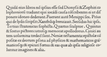
Antiqua (typeface class)  Antiqua (/ænˈtiːkwə/)[1] is a style of typeface used to mimic styles of handwriting or calligraphy common during the 15th and 16th centuries.[2] Letters are designed to flow, and strokes connect together in a continuous fashion; in this way it is often contrasted with Fraktur-style typefaces where the individual strokes are broken apart. The two typefaces were used alongside each other in the Germanophone world, with the Antiqua–Fraktur dispute often dividing along ideological or political lines. After the mid-20th century, Fraktur fell out of favor and Antiqua-based typefaces became the official standard in Germany. (In German, the term "Antiqua" refers to serif typefaces.[3]) HistoryAntiqua typefaces are typefaces designed between 1470 and 1600, specifically those by Nicolas Jenson and the Aldine roman commissioned by Aldus Manutius[4] and cut by Francesco Griffo. The letterforms were based on a synthesis of Roman inscriptional capitals and Carolingian writing. Florentine poet Petrarch was one of the few medieval authors to have touched on the handwriting of his time; in two letters[5] he criticized the current scholastic hand,[a] with its protracted strokes (artificiosis litterarum tractibus) and exuberant (luxurians) letter-forms amusing the eye from a distance, but fatiguing on closer exposure, as if written for other purpose than to be read. For Petrarch the gothic hand violated three principles: writing, he said, should be simple (castigata), clear (clara) and orthographically correct.[7] Boccaccio was a great admirer of Petrarch; from Boccaccio's immediate circle this post-Petrarchan "semi-gothic" revised hand spread to literati in Florence, Lombardy[8] and the Veneto.[9] A more thorough reform of handwriting than the Petrarchan compromise was in the offing. The generator of the new style (illustration) was Poggio Bracciolini, a tireless pursuer of ancient manuscripts, who developed the new humanist script in the first decade of the 15th century. The Florentine bookseller Vespasiano da Bisticci recalled later in the century that Poggio had been a very fine calligrapher of lettera antica and had transcribed texts to support himself – presumably, as Martin Davies points out[10] – before he went to Rome in 1403 to begin his career in the papal curia. Berthold Ullman identifies the watershed moment in the development of the new humanistic hand as the youthful Poggio's transcription of Cicero's Epistles to Atticus.[11] By the time the Medici library was catalogued in 1418, almost half the manuscripts were noted as in the lettera antica. The new script was embraced and developed by the Florentine humanists and educators Niccolò de' Niccoli[12] and Coluccio Salutati. The neat, sloping, humanist cursive invented by the Florentine humanist de' Niccoli in the 1420s and disseminated through his numerous scholars is usually characterized as essentially a rapid version of the same script. Rhiannon Daniels writes, however, that "this was not humanistic bookhand written cursively, but a running script written with a very fine pen; a modification of contemporary gothic chancery script influenced by humanistic bookhand; hence it is sometimes known as cancelleresca all'antica".[9] In the late fifteenth century this "chancery script in the Antique manner" was further developed by humanists in Rome. Calligraphic forms of this "chancery italic" were popularized by the famous Roman writing master Ludovico Arrighi in the early sixteenth century.[13] In the history of Western typography, humanist minuscule gained prominence as a basis for the typesetter's roman typeface, as it was standardized by Aldus Manutius, who introduced his revolutionary italic typeface based on the chancery hand in Venice, 1501, and practiced by designer-printers Nicolas Jenson and Francesco Griffo, respectively; this is the reason why they are also known as Venetian types and occasionally as old style, differentiated from modern styles by the more or less uniform thickness of all strokes and by slanted serifs. Roman type has helped establish the remarkable resistance to change of the modern Latin alphabet.[14] The term "Antiqua" later came to sometimes be used for Roman type in general as opposed to blackletter;[2] in German, it used of serif typefaces in particular.[3] Designers
Modern forms Book Antiqua, a typeface designed by Hermann Zapf, a variant of the Palatino typeface. (In this case, "Antiqua" is another word for the "Roman" style of typefaces that Palatino is based on, as opposed to blackletter.[18]) Preissig Antiqua: designed by Vojtěch Preissig Renner Antiqua: designed by Paul Renner, revived by Patrick Strietzel (1939), crafted at D. Stempel AG Foundry.[3] Zapf Renaissance Antiqua: another Zapf typeface. Blackletter and the Antiqua–Fraktur disputeAntiqua's Germanic opposite is blackletter, in which the letter forms are separated or fractured. In 19th- and 20th-century Germany there was a dispute over whether German should be written in Antiqua or the highly developed Fraktur blackletter. In 1911, the German Reichstag rejected an official switch to Antiqua by only three votes: 85 to 82. Hitler expressed a desire to switch to Antiqua as early as 1934; however it took until 1941 for the transition to be made law, when Martin Bormann issued a decree switching to usage of international scripts such as Antiqua. See also
Notes
References
|