|
Scientific visualization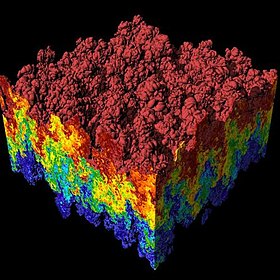 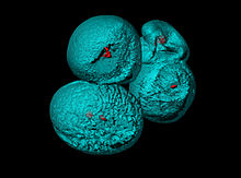 Scientific visualization (also spelled scientific visualisation) is an interdisciplinary branch of science concerned with the visualization of scientific phenomena.[2] It is also considered a subset of computer graphics, a branch of computer science. The purpose of scientific visualization is to graphically illustrate scientific data to enable scientists to understand, illustrate, and glean insight from their data. Research into how people read and misread various types of visualizations is helping to determine what types and features of visualizations are most understandable and effective in conveying information.[3][4] History One of the earliest examples of three-dimensional scientific visualisation was Maxwell's thermodynamic surface, sculpted in clay in 1874 by James Clerk Maxwell.[5] This prefigured modern scientific visualization techniques that use computer graphics.[6] Notable early two-dimensional examples include the flow map of Napoleon's March on Moscow produced by Charles Joseph Minard in 1869;[2] the "coxcombs" used by Florence Nightingale in 1857 as part of a campaign to improve sanitary conditions in the British Army;[2] and the dot map used by John Snow in 1855 to visualise the Broad Street cholera outbreak.[2] Data visualization methodsCriteria for classifications:
Two-dimensional data setsScientific visualization using computer graphics gained in popularity as graphics matured. Primary applications were scalar fields and vector fields from computer simulations and also measured data. The primary methods for visualizing two-dimensional (2D) scalar fields are color mapping and drawing contour lines. 2D vector fields are visualized using glyphs and streamlines or line integral convolution methods. 2D tensor fields are often resolved to a vector field by using one of the two eigenvectors to represent the tensor each point in the field and then visualized using vector field visualization methods. Three-dimensional data setsFor 3D scalar fields the primary methods are volume rendering and isosurfaces. Methods for visualizing vector fields include glyphs (graphical icons) such as arrows, streamlines and streaklines, particle tracing, line integral convolution (LIC) and topological methods. Later, visualization techniques such as hyperstreamlines[7] were developed to visualize 2D and 3D tensor fields. Topics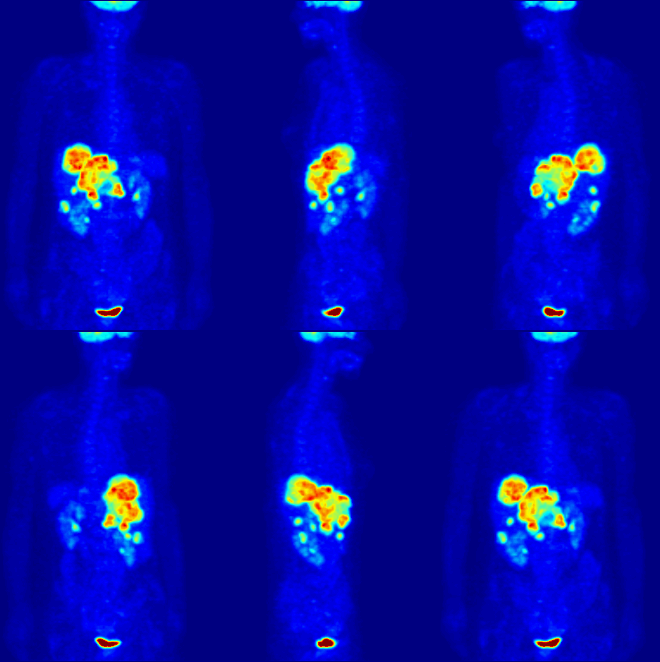 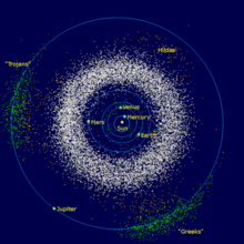    Computer animationComputer animation is the art, technique, and science of creating moving images via the use of computers. It is becoming more common to be created by means of 3D computer graphics, though 2D computer graphics are still widely used for stylistic, low bandwidth, and faster real-time rendering needs. Sometimes the target of the animation is the computer itself, but sometimes the target is another medium, such as film. It is also referred to as CGI (Computer-generated imagery or computer-generated imaging), especially when used in films. Applications include medical animation, which is most commonly utilized as an instructional tool for medical professionals or their patients. Computer simulationComputer simulation is a computer program, or network of computers, that attempts to simulate an abstract model of a particular system. Computer simulations have become a useful part of mathematical modelling of many natural systems in physics, and computational physics, chemistry and biology; human systems in economics, psychology, and social science; and in the process of engineering and new technology, to gain insight into the operation of those systems, or to observe their behavior.[8] The simultaneous visualization and simulation of a system is called visulation. Computer simulations vary from computer programs that run a few minutes, to network-based groups of computers running for hours, to ongoing simulations that run for months. The scale of events being simulated by computer simulations has far exceeded anything possible (or perhaps even imaginable) using the traditional paper-and-pencil mathematical modeling: over 10 years ago, a desert-battle simulation, of one force invading another, involved the modeling of 66,239 tanks, trucks and other vehicles on simulated terrain around Kuwait, using multiple supercomputers in the DoD High Performance Computing Modernization Program.[9] Information visualizationInformation visualization is the study of "the visual representation of large-scale collections of non-numerical information, such as files and lines of code in software systems, library and bibliographic databases, networks of relations on the internet, and so forth".[2] Information visualization focused on the creation of approaches for conveying abstract information in intuitive ways. Visual representations and interaction techniques take advantage of the human eye's broad bandwidth pathway into the mind to allow users to see, explore, and understand large amounts of information at once.[10] The key difference between scientific visualization and information visualization is that information visualization is often applied to data that is not generated by scientific inquiry. Some examples are graphical representations of data for business, government, news and social media. Interface technology and perceptionInterface technology and perception shows how new interfaces and a better understanding of underlying perceptual issues create new opportunities for the scientific visualization community.[11] Surface renderingRendering is the process of generating an image from a model, by means of computer programs. The model is a description of three-dimensional objects in a strictly defined language or data structure. It would contain geometry, viewpoint, texture, lighting, and shading information. The image is a digital image or raster graphics image. The term may be by analogy with an "artist's rendering" of a scene. 'Rendering' is also used to describe the process of calculating effects in a video editing file to produce final video output. Important rendering techniques are:
Volume renderingVolume rendering is a technique used to display a 2D projection of a 3D discretely sampled data set. A typical 3D data set is a group of 2D slice images acquired by a CT or MRI scanner. Usually these are acquired in a regular pattern (e.g., one slice every millimeter) and usually have a regular number of image pixels in a regular pattern. This is an example of a regular volumetric grid, with each volume element, or voxel represented by a single value that is obtained by sampling the immediate area surrounding the voxel. Volume visualizationAccording to Rosenblum (1994) "volume visualization examines a set of techniques that allows viewing an object without mathematically representing the other surface. Initially used in medical imaging, volume visualization has become an essential technique for many sciences, portraying phenomena become an essential technique such as clouds, water flows, and molecular and biological structure. Many volume visualization algorithms are computationally expensive and demand large data storage. Advances in hardware and software are generalizing volume visualization as well as real time performances". Developments of web-based technologies, and in-browser rendering have allowed of simple volumetric presentation of a cuboid with a changing frame of reference to show volume, mass and density data.[11] ApplicationsThis section will give a series of examples how scientific visualization can be applied today.[12] In the natural sciencesStar formation: The featured plot is a Volume plot of the logarithm of gas/dust density in an Enzo star and galaxy simulation. Regions of high density are white while less dense regions are more blue and also more transparent. Gravitational waves: Researchers used the Globus Toolkit to harness the power of multiple supercomputers to simulate the gravitational effects of black-hole collisions. Massive Star Supernovae Explosions: In the image, three-Dimensional Radiation Hydrodynamics Calculations of Massive Star Supernovae Explosions The DJEHUTY stellar evolution code was used to calculate the explosion of SN 1987A model in three dimensions. Molecular rendering: VisIt's general plotting capabilities were used to create the molecular rendering shown in the featured visualization. The original data was taken from the Protein Data Bank and turned into a VTK file before rendering. In geography and ecology
Terrain visualization: VisIt can read several file formats common in the field of Geographic Information Systems (GIS), allowing one to plot raster data such as terrain data in visualizations. The featured image shows a plot of a DEM dataset containing mountainous areas near Dunsmuir, CA. Elevation lines are added to the plot to help delineate changes in elevation. Tornado Simulation: This image was created from data generated by a tornado simulation calculated on NCSA's IBM p690 computing cluster. High-definition television animations of the storm produced at NCSA were included in an episode of the PBS television series NOVA called "Hunt for the Supertwister." The tornado is shown by spheres that are colored according to pressure; orange and blue tubes represent the rising and falling airflow around the tornado. Climate visualization: This visualization depicts the carbon dioxide from various sources that are advected individually as tracers in the atmosphere model. Carbon dioxide from the ocean is shown as plumes during February 1900. Atmospheric Anomaly in Times Square In the image the results from the SAMRAI simulation framework of an atmospheric anomaly in and around Times Square are visualized. In mathematicsScientific visualization of mathematical structures has been undertaken for purposes of building intuition and for aiding the forming of mental models.[16] 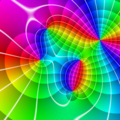 Higher-dimensional objects can be visualized in form of projections (views) in lower dimensions. In particular, 4-dimensional objects are visualized by means of projection in three dimensions. The lower-dimensional projections of higher-dimensional objects can be used for purposes of virtual object manipulation, allowing 3D objects to be manipulated by operations performed in 2D,[17] and 4D objects by interactions performed in 3D.[18] In complex analysis, functions of the complex plane are inherently 4-dimensional, but there is no natural geometric projection into lower dimensional visual representations. Instead, colour vision is exploited to capture dimensional information using techniques such as domain coloring. In the formal sciences
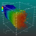
Computer mapping of topographical surfaces: Through computer mapping of topographical surfaces, mathematicians can test theories of how materials will change when stressed. The imaging is part of the work on the NSF-funded Electronic Visualization Laboratory at the University of Illinois at Chicago. Curve plots: VisIt can plot curves from data read from files and it can be used to extract and plot curve data from higher-dimensional datasets using lineout operators or queries. The curves in the featured image correspond to elevation data along lines drawn on DEM data and were created with the feature lineout capability. Lineout allows you to interactively draw a line, which specifies a path for data extraction. The resulting data was then plotted as curves. Image annotations: The featured plot shows Leaf Area Index (LAI), a measure of global vegetative matter, from a NetCDF dataset. The primary plot is the large plot at the bottom, which shows the LAI for the whole world. The plots on top are actually annotations that contain images generated earlier. Image annotations can be used to include material that enhances a visualization such as auxiliary plots, images of experimental data, project logos, etc. Scatter plot: VisIt's Scatter plot allows visualizing multivariate data of up to four dimensions. The Scatter plot takes multiple scalar variables and uses them for different axes in phase space. The different variables are combined to form coordinates in the phase space and they are displayed using glyphs and colored using another scalar variable. In the applied sciences
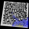
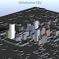
Porsche 911 model (NASTRAN model): The featured plot contains a Mesh plot of a Porsche 911 model imported from a NASTRAN bulk data file. VisIt can read a limited subset of NASTRAN bulk data files, in general enough to import model geometry for visualization. YF-17 aircraft Plot: The featured image displays plots of a CGNS dataset representing a YF-17 jet aircraft. The dataset consists of an unstructured grid with solution. The image was created by using a pseudocolor plot of the dataset's Mach variable, a Mesh plot of the grid, and Vector plot of a slice through the Velocity field. City rendering: An ESRI shapefile containing a polygonal description of the building footprints was read in and then the polygons were resampled onto a rectilinear grid, which was extruded into the featured cityscape. Inbound traffic measured: This image is a visualization study of inbound traffic measured in billions of bytes on the NSFNET T1 backbone for the month of September 1991. The traffic volume range is depicted from purple (zero bytes) to white (100 billion bytes). It represents data collected by Merit Network, Inc.[19] OrganizationsImportant laboratories in the field are:
Conferences in this field, ranked by significance in scientific visualization research,[20] are:
See further: Computer graphics organizations, Supercomputing facilities See also
References
Further reading
External linksWikimedia Commons has media related to Scientific visualization.
|
![Star formation[13]](http://upload.wikimedia.org/wikipedia/commons/thumb/c/c7/Star_formation.jpg/120px-Star_formation.jpg)
![Gravitational waves[14]](http://upload.wikimedia.org/wikipedia/commons/thumb/a/ac/Gravitywaves.JPG/120px-Gravitywaves.JPG)


![Climate visualization[15]](http://upload.wikimedia.org/wikipedia/commons/thumb/2/23/Climate_visualization.jpg/120px-Climate_visualization.jpg)
